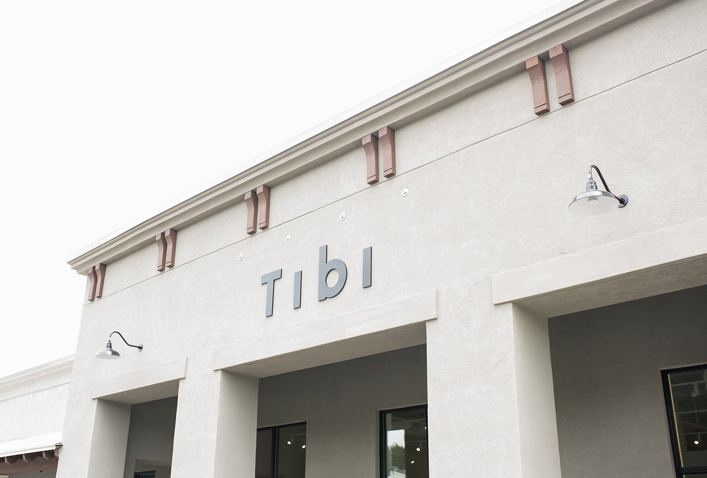
CLIENT: TIBI
SERVICE: VISUAL IDENTITY, PACKAGING
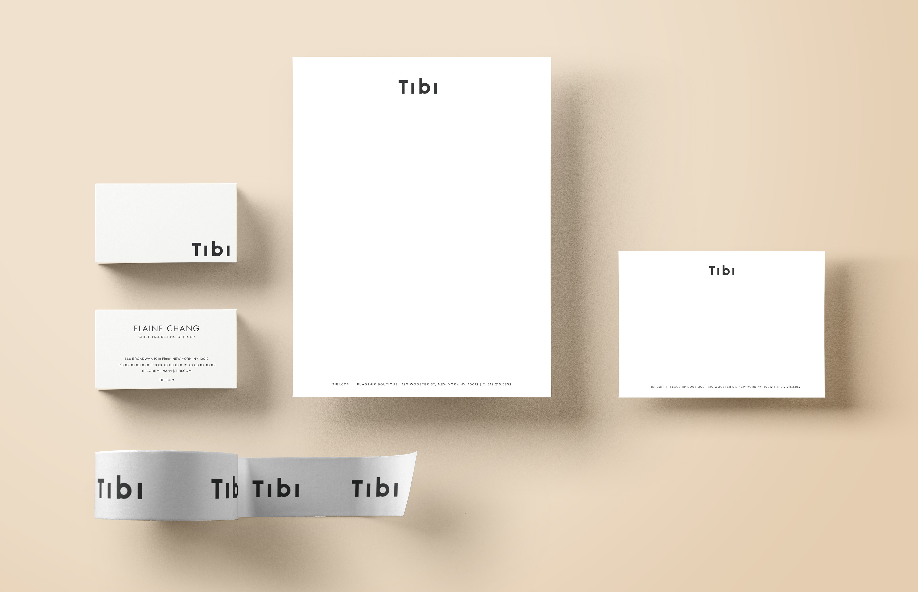
Tibi was rebranded in 2016 by Palmer Schwartz Agency. The result was a modern, well-balanced and geometric logotype that truly reflected Tibi's new aesthetic. What was left to be done was connecting the dots between all of the the other branding elements. This included the brand's business cards, letterhead, notecards, as well as packing tape.
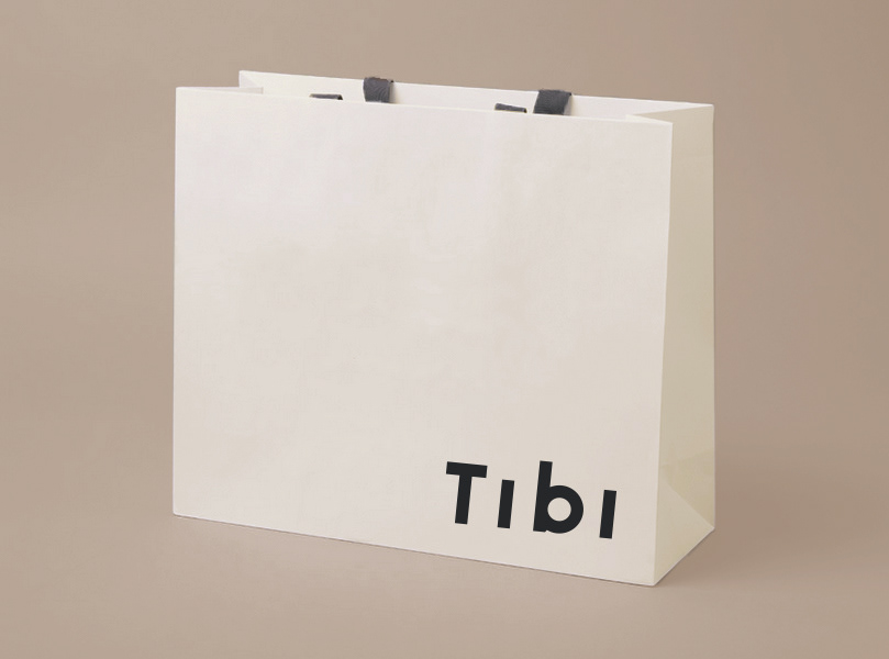
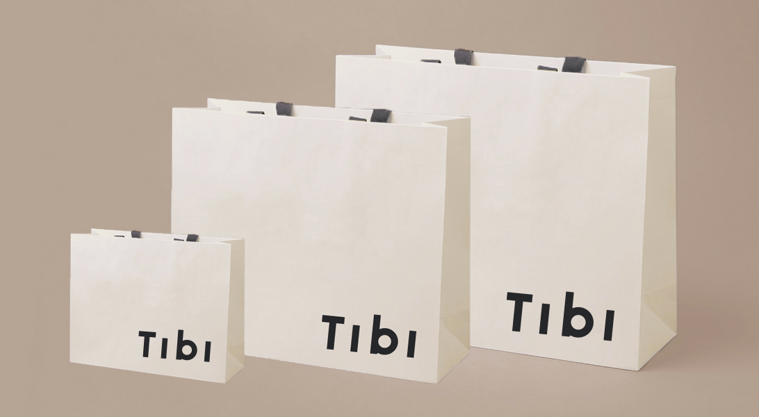
The largest assignment for the rebranding, was the creation of new shopping bags for Tibi's Boutique. On one hand they had to be luxurious, while on the other hand they needed to be functional and easy to carry. The final trio of bags included the big size (large enough to fit a garment bag and two boxes of shoes), medium (large enough for several items of clothing), and small (perfect for smaller items like a scarf or camisole). Handles were made of a soft fabric long enough to throw over one's shoulder.
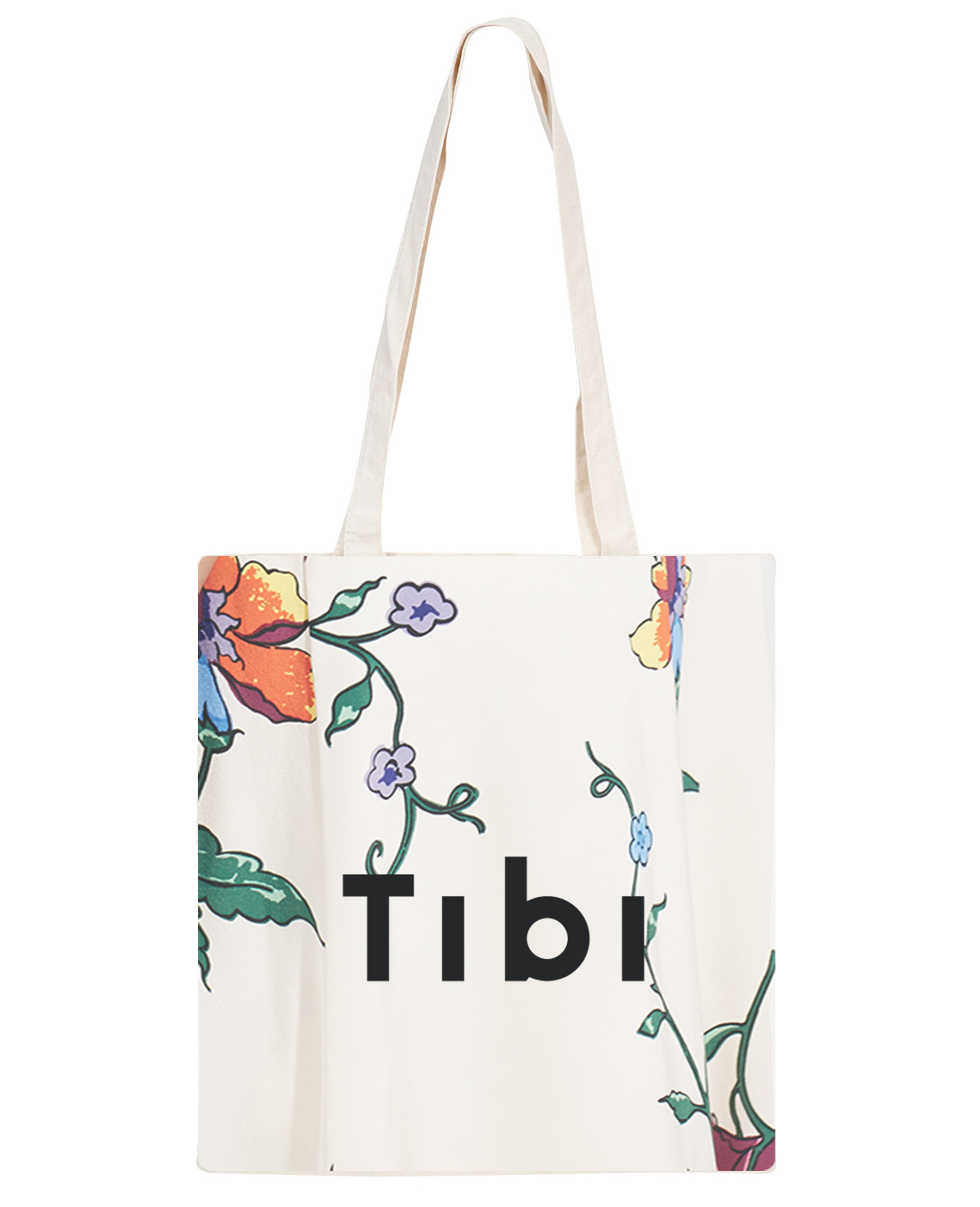
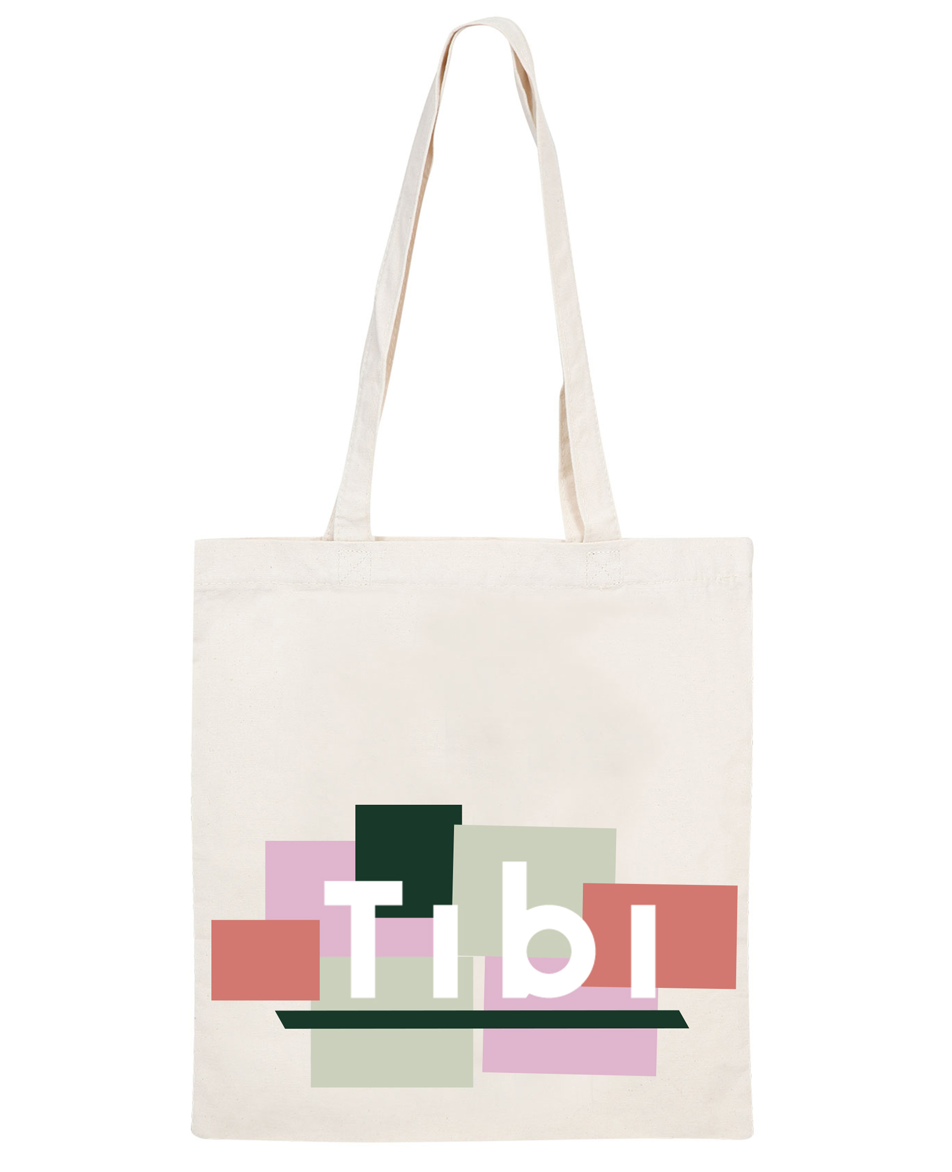
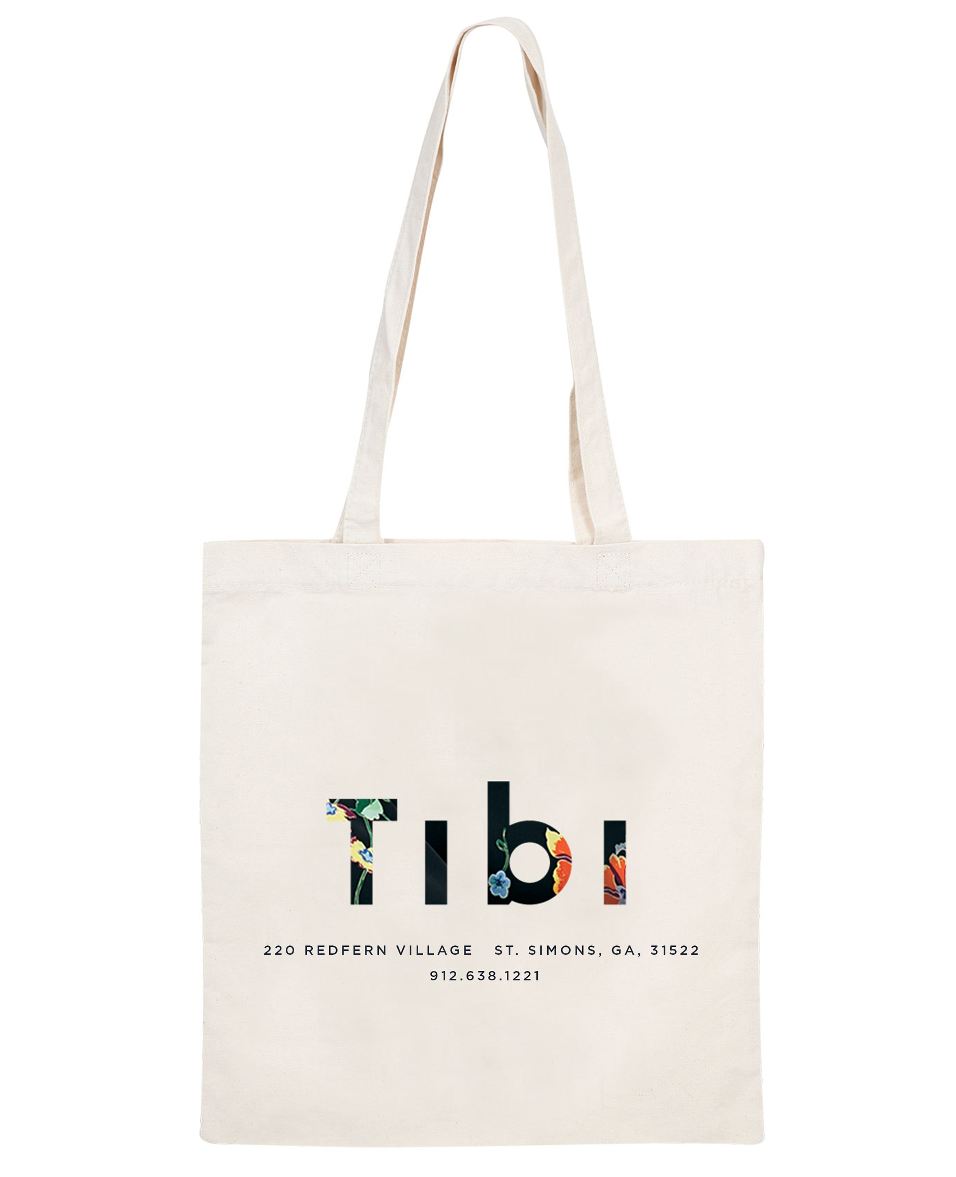
SERVICE: VISUAL IDENTITY, PACKAGING, ILLUSTRATION
Tibi's outlet store in St. Simon's Island, Georgia is a hidden gem that most don't know about. These three canvas tote bags were designed with the energy and cheeriness of island life in mind.

SERVICE: VISUAL IDENTITY, PACKAGING
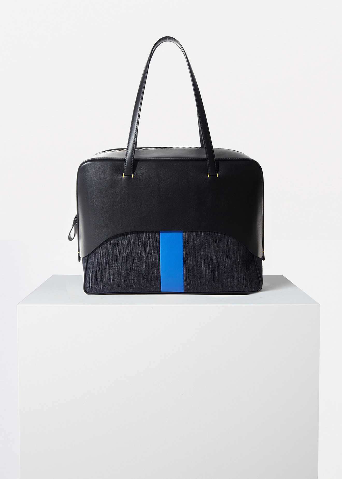
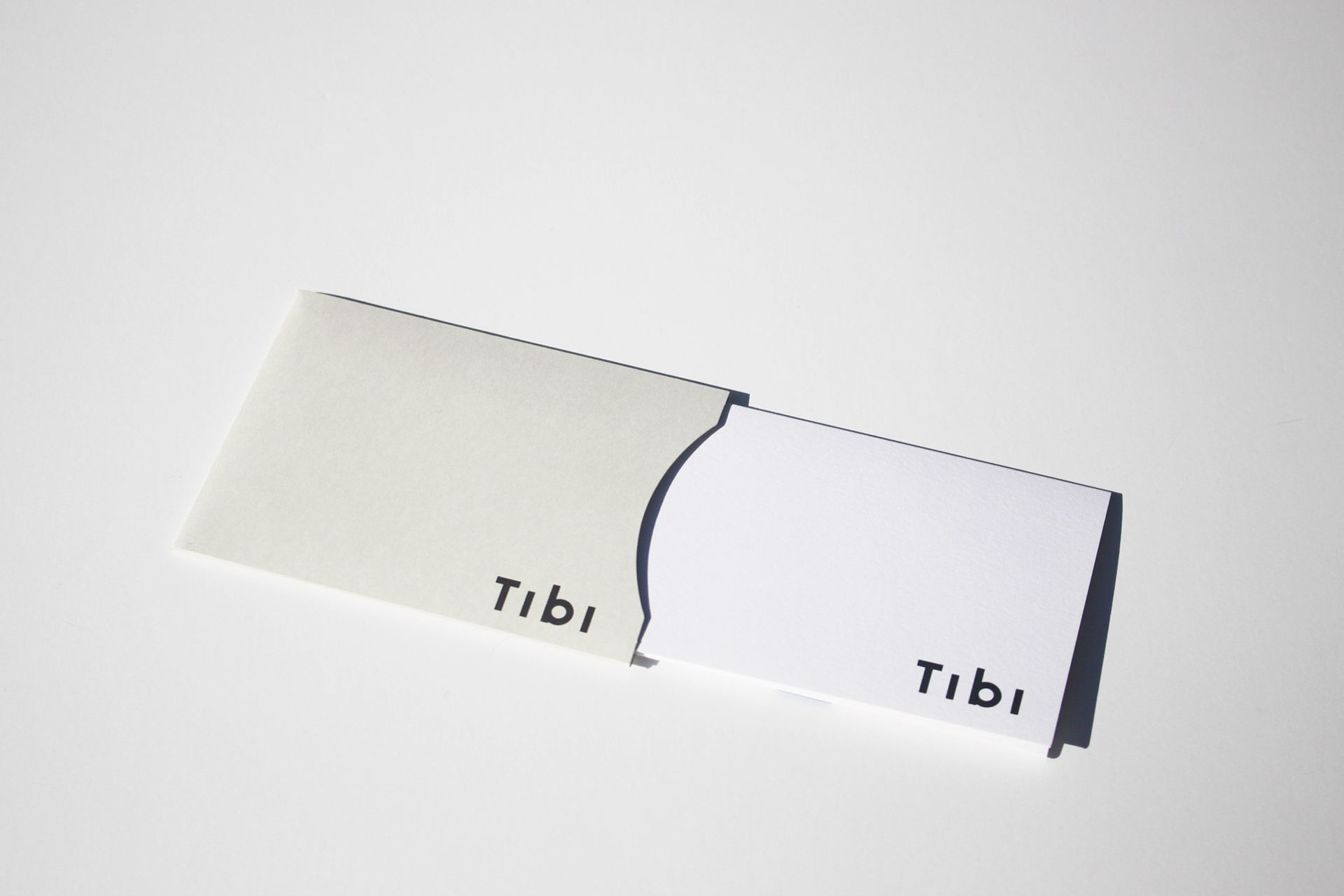
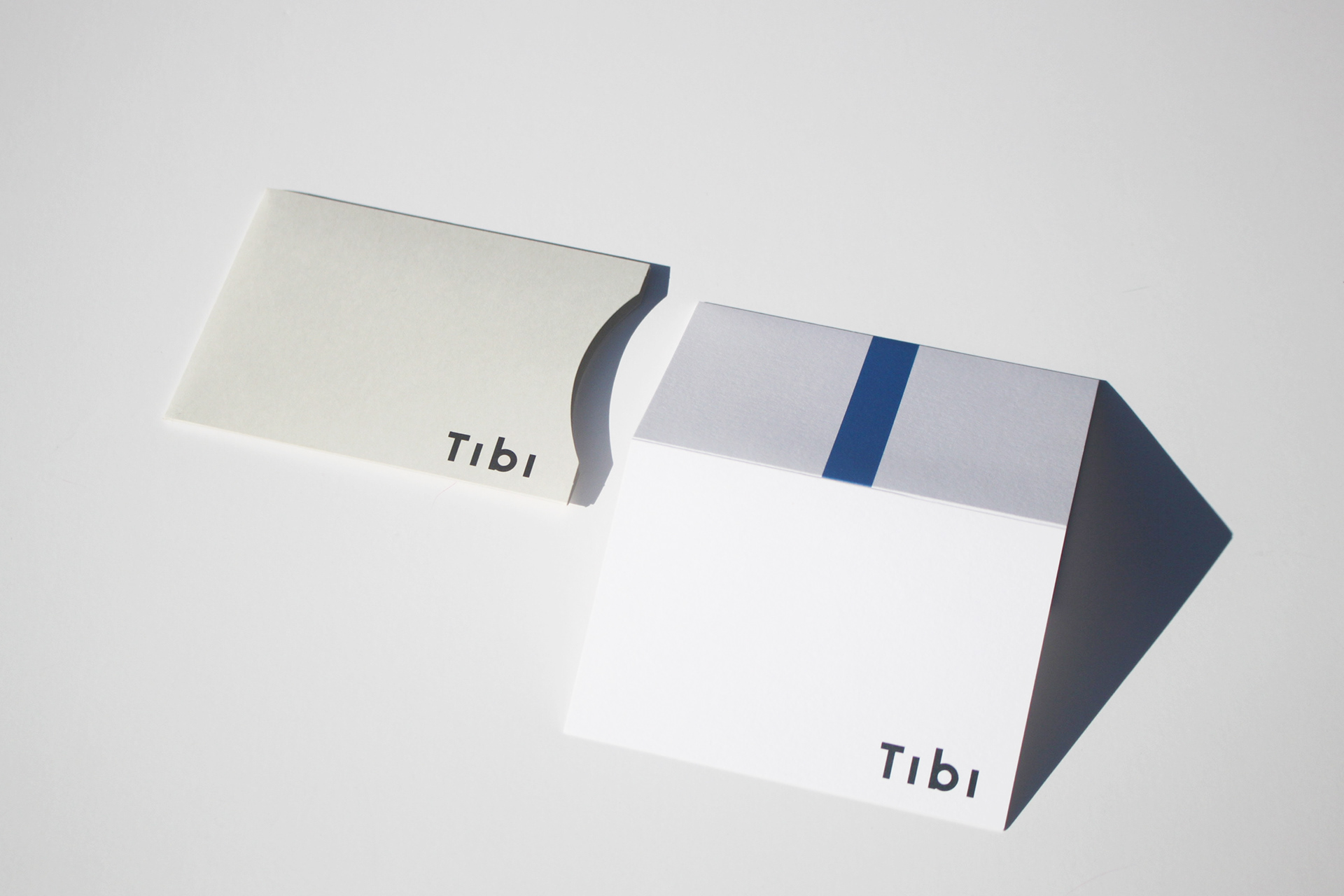
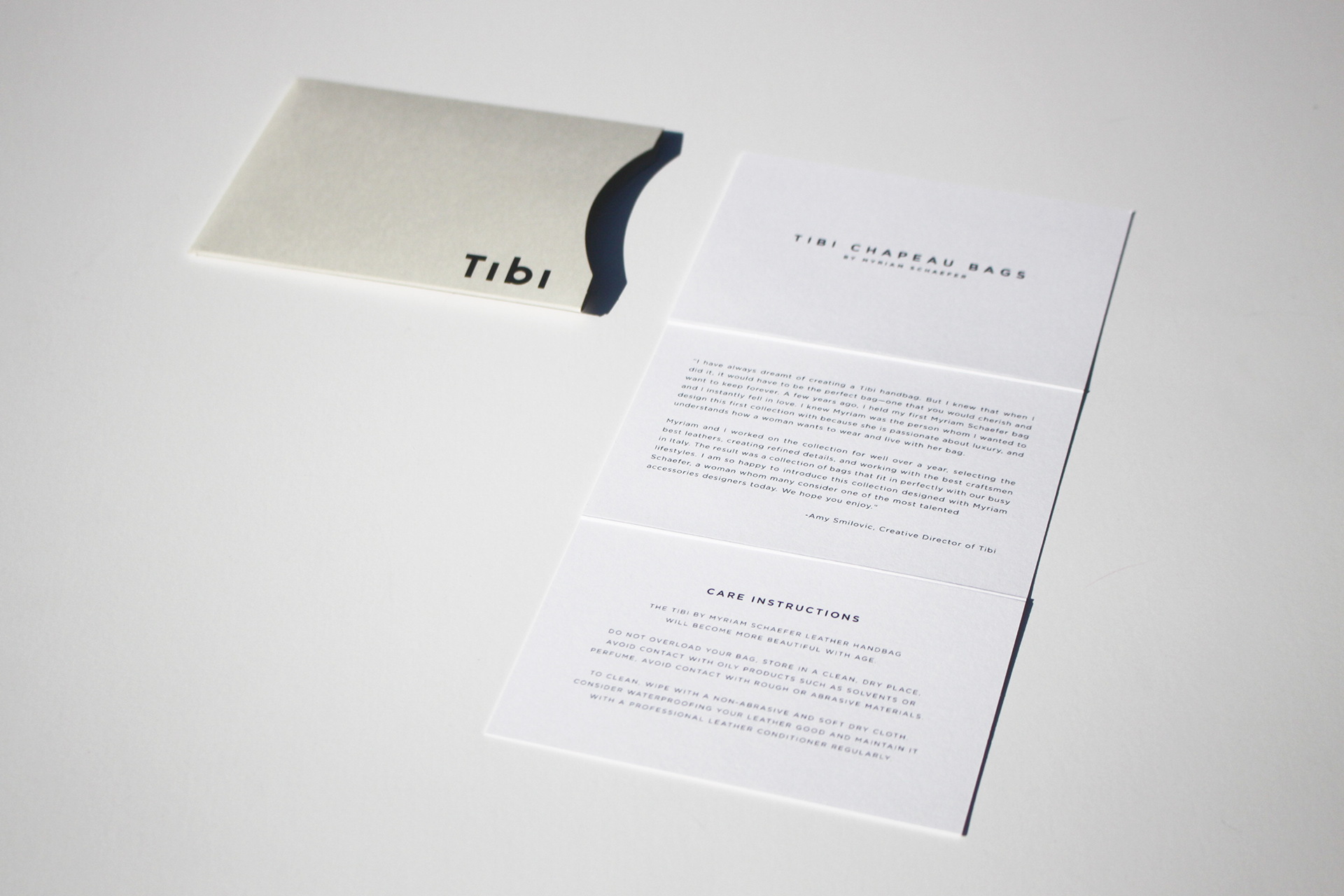
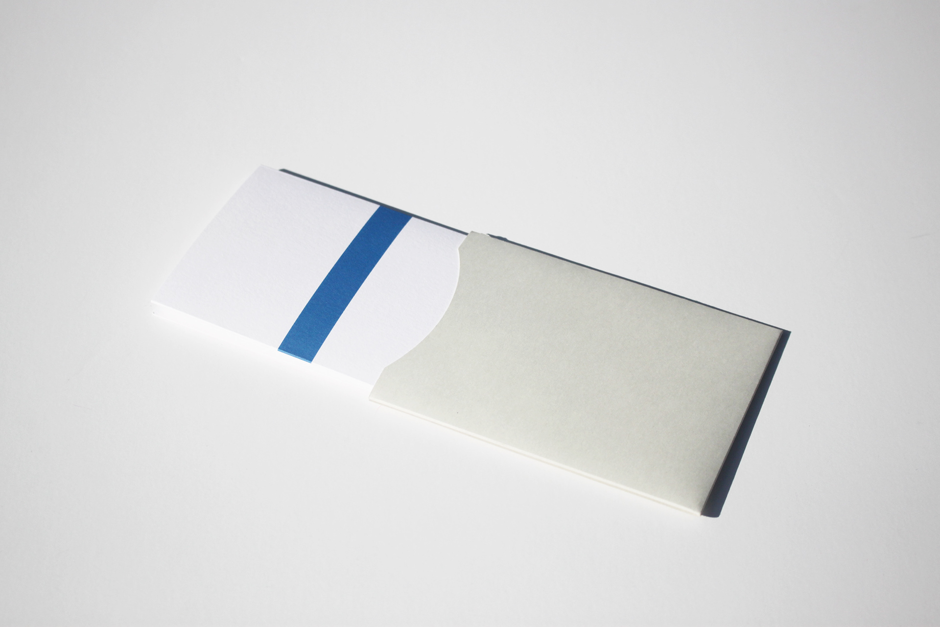
For the launch of Tibi's first handbag collection, The Chapeau Collection, trifold care cards were designed to teach consumers all about the making of the bags. They feature both a personal letter from Amy Smilovic, the founder and designer of Tibi, as well as care instructions. A unique characteristic of the bags are these graphic stripes of color, in complementary shades of blue, yellow, & green down the middle of each bag. To play off of this idea, there is a blue stripe down the back of each card.